
A figure can be worth a thousand words. In an ERC Starting Grant Part I, it can also cost a meaningful fraction of five pages.
That means every figure has to earn its space.
I use figures when they clarify scientific structure faster than prose can. I would not include a diagram simply to make the proposal look polished. In a short scientific proposal, decoration is expensive.
What a strong ERC figure should do
A useful figure normally performs one of four jobs.
1. Show the unresolved scientific problem
The figure makes visible the gap between current understanding and the regime the proposal addresses.
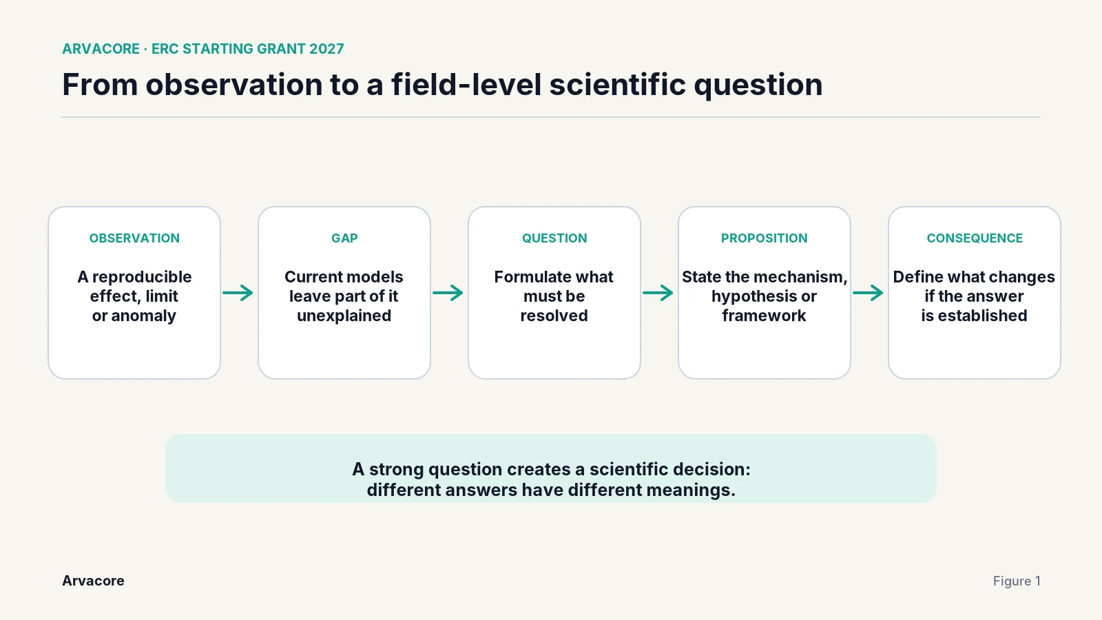
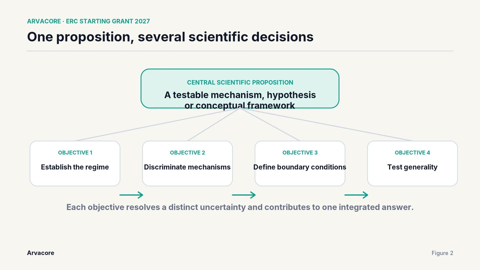
2. Show the logic from hypothesis to objectives
The reader sees why each objective exists and how the programme tests the central proposition.
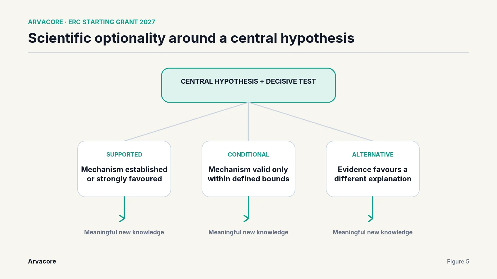
3. Show the outcome space
The figure makes clear that several results can produce scientific value.
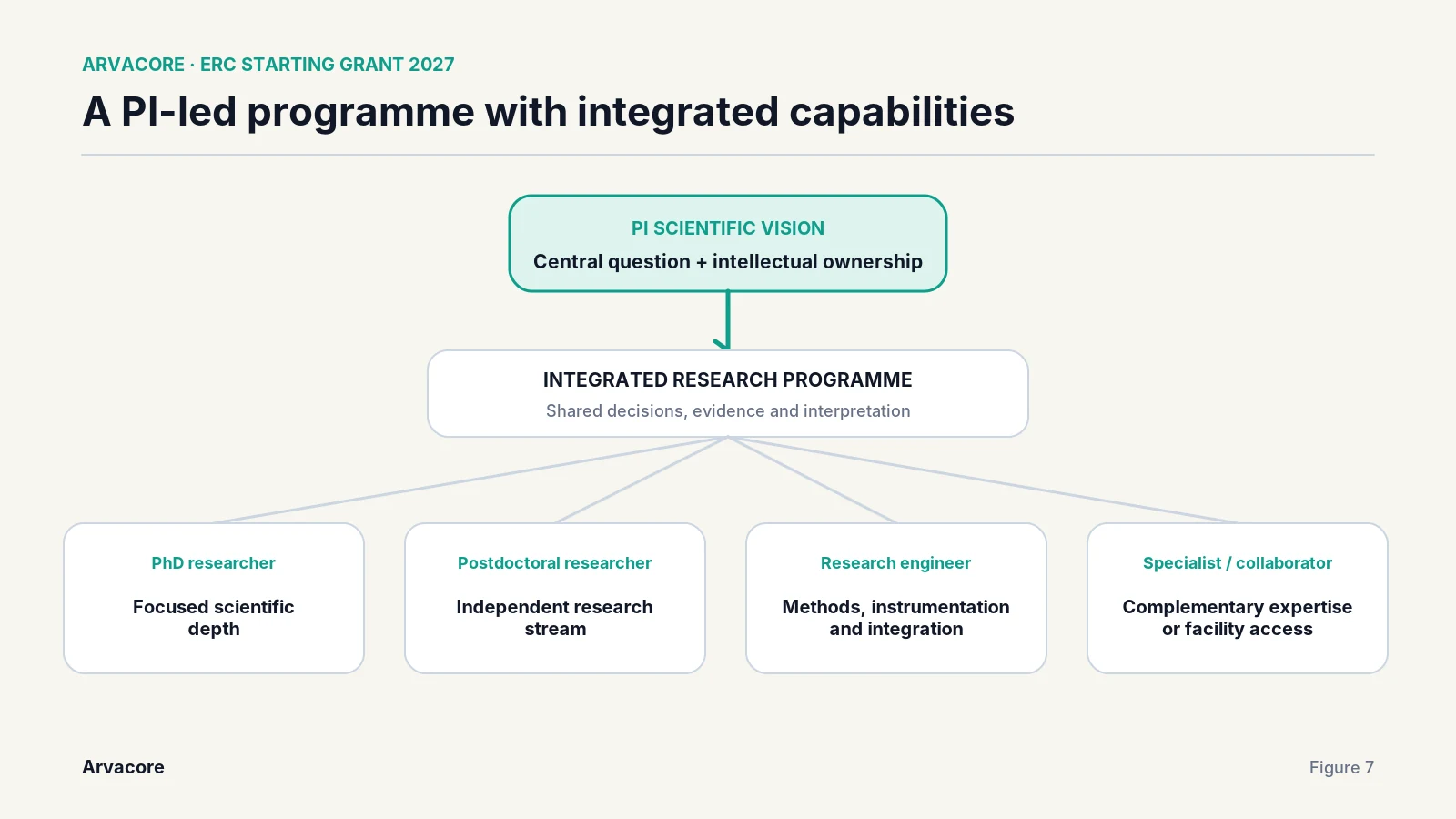
4. Show the programme architecture
The reader can understand the relationship between the PI, team, objectives and scientific decisions.
A figure that performs none of these jobs is probably using space that the text needs more.
The first figure is especially important
If Part I contains only one figure, I would often make it a conceptual figure near the beginning.
The ideal first figure answers:
- What does the field currently understand?
- Where does that understanding stop?
- What does this project propose to test or change?
That gives the reviewer a map for the rest of the proposal.
A title such as "Project overview" wastes an opportunity.
A stronger title states the scientific point:
The project tests whether the accepted performance limit is fundamental or emerges from an untested assumption.
A good figure title can carry part of the argument.
Conceptual figures are often more useful than workflow figures in Part I
Many proposals default to a left-to-right diagram of WP1, WP2, WP3 and WP4.
That may be useful later. It is rarely the first thing I want a reviewer to understand.
The first question is not how the project is administered. It is why the science matters.
For Part I, I would often prefer:
- a state-of-the-art boundary;
- competing scientific models;
- a conceptual mechanism;
- a hypothesis and outcome tree;
- a map of the unexplored regime.
Work-package diagrams are more naturally useful in Part II, where implementation becomes central.
A figure should reduce cognitive load
Technical density is not the same as scientific depth.
A figure becomes difficult when it contains:
- several font sizes;
- many arrows with no hierarchy;
- complete paragraphs inside boxes;
- acronyms introduced only in the figure;
- colour coding that is not explained;
- multiple unrelated messages.
The reader should be able to identify the main scientific statement within seconds.
My preferred test is:
If the figure disappeared, would the reviewer need a paragraph or more to recover the same idea?
If the answer is no, the figure may not be doing enough work.
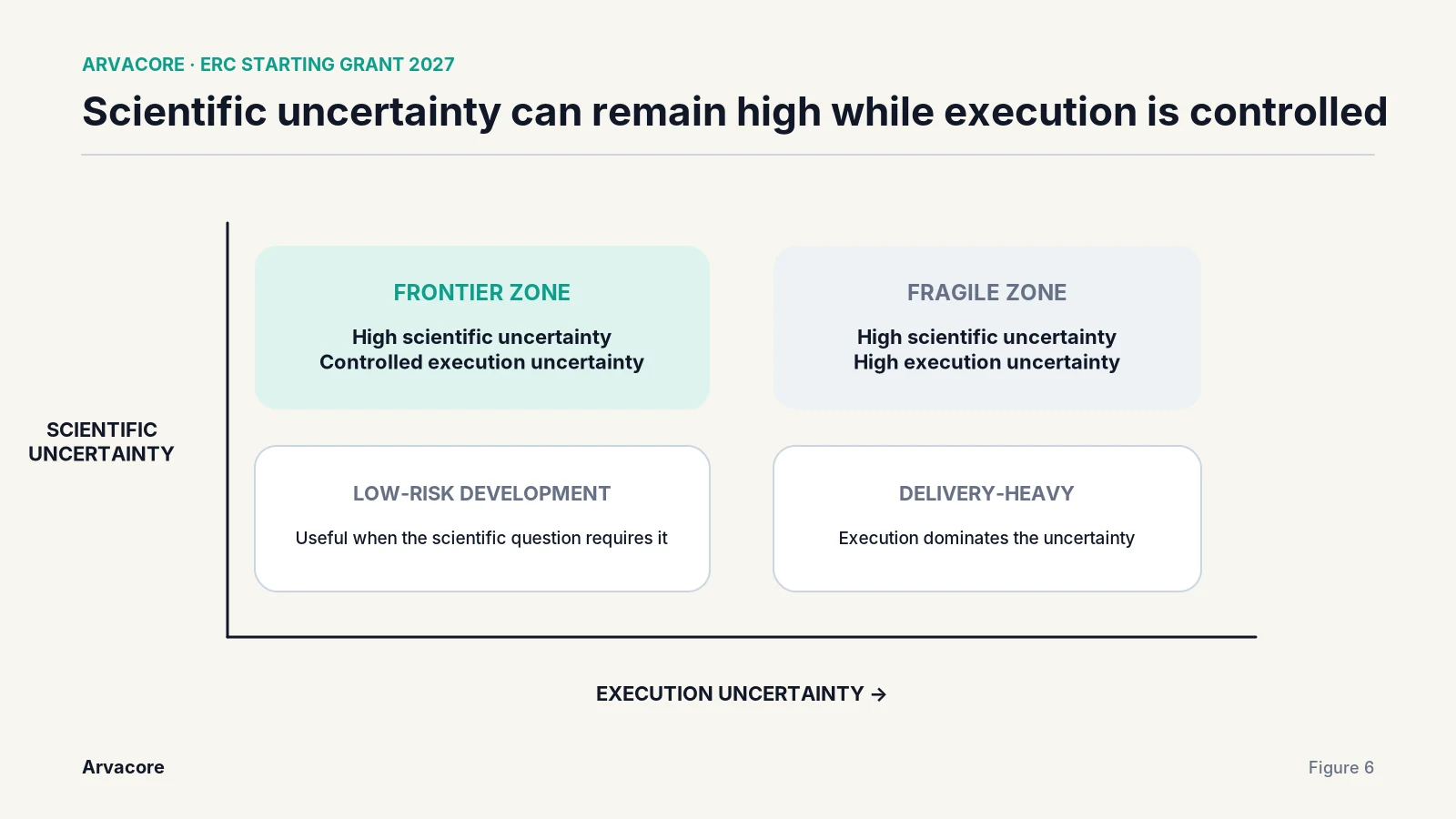
Show contrasts clearly
Scientific proposals often depend on a contrast:
- current model vs proposed model;
- accessible regime vs unexplored regime;
- expected result A vs B;
- incremental improvement vs new capability;
- scientific risk vs execution risk.
Figures are particularly effective for these comparisons because the reader can see the distinction rather than reconstruct it from prose.
Do not make the reviewer decode the graphic
A scientific figure should remain understandable when printed, viewed quickly and reduced on screen.
Useful design rules are simple:
- keep one message per figure;
- use short labels;
- make the reading order obvious;
- place the scientific conclusion in the caption or title;
- avoid decorative icons that imply meaning they do not carry;
- keep text large enough to read at normal page scale;
- use consistent terminology with the proposal.
The figure is part of the scientific argument, not a poster.
Use captions to finish the reasoning
A caption should not merely describe what objects are visible.
Weak caption:
Figure 2. Overview of the proposed methodology.
Stronger caption:
Figure 2. The programme uses two independent measurements to discriminate between mechanisms A and B; either outcome resolves the central uncertainty in Objective 2.
The second caption tells the reviewer why the figure matters.
Figures can help in a world of AI-heavy text
Scientific writing is increasingly surrounded by machine-assisted drafting. This makes generic prose easier to produce and less distinctive.
A genuinely useful scientific figure still requires someone to decide what the important structure is.
The value is not that a figure looks more human. The value is that it exposes scientific judgement.
What did you choose to simplify?
Which comparison did you make visible?
Which uncertainty did you put at the centre?
Those decisions can reveal ownership of the idea more clearly than another polished paragraph.
Part I and Part II need different visual priorities
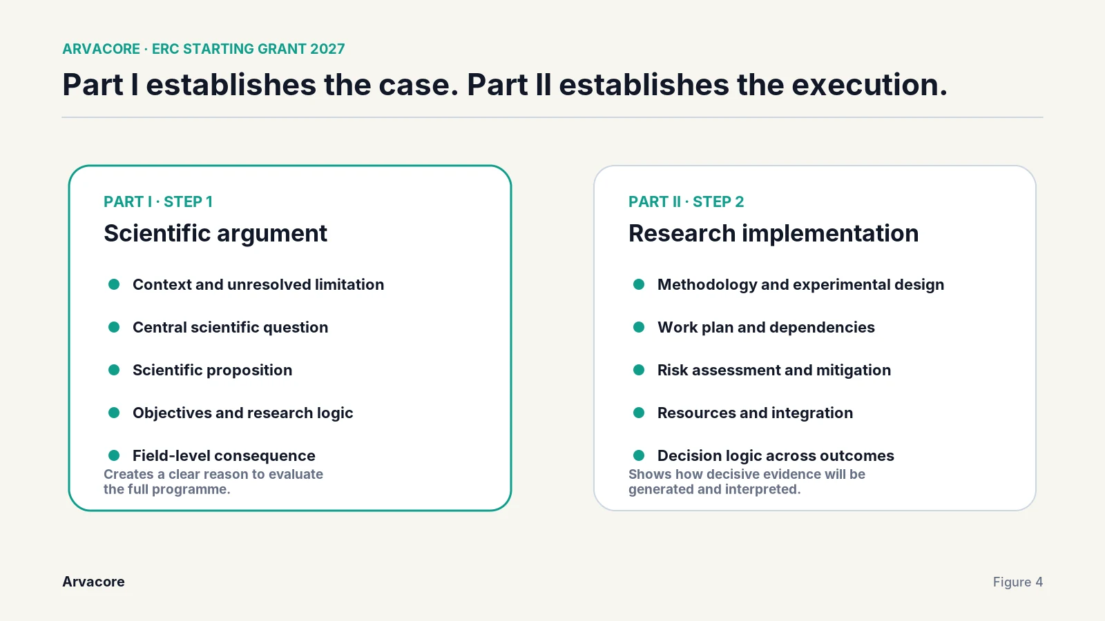
For Part I, figures should prioritise:
- scientific context;
- central question;
- conceptual leap;
- outcome space;
- field-level consequence.
For Part II, figures can prioritise:
- experimental architecture;
- dependencies;
- decision points;
- timeline;
- team/resource structure;
- risk handling.
This keeps each visual aligned with the job of that part of the proposal.
A practical figure checklist
Before keeping a figure, ask:
- Does it communicate one scientific idea?
- Does it add information rather than repeat the text?
- Can it be understood at normal page size?
- Does the title state a scientific conclusion or purpose?
- Does the caption explain why it matters?
- Would the proposal be harder to understand without it?
- Is the space worth the scientific clarity gained?
If several answers are no, remove or redesign it.
Final point
Figures work best alongside clear scientific writing. Their value is to make the architecture of the science visible.
In a five-page Part I, I would rather have one excellent conceptual figure than four generic diagrams. The right figure can give the reviewer a mental model that makes every paragraph after it easier to understand.